Flip for Bali
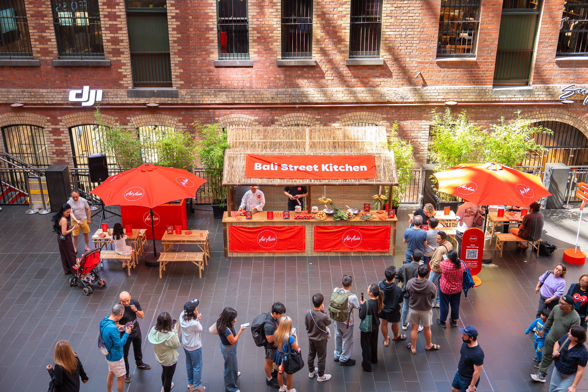
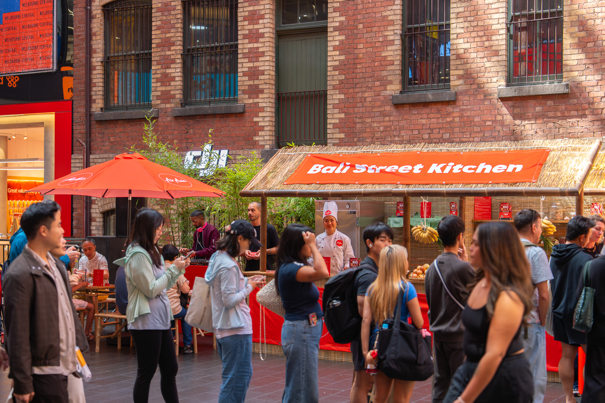
Ten Hats in collaboration with We Are Komodo brought a slice of Bali to Melbourne Central through an immersive AirAsia activation.
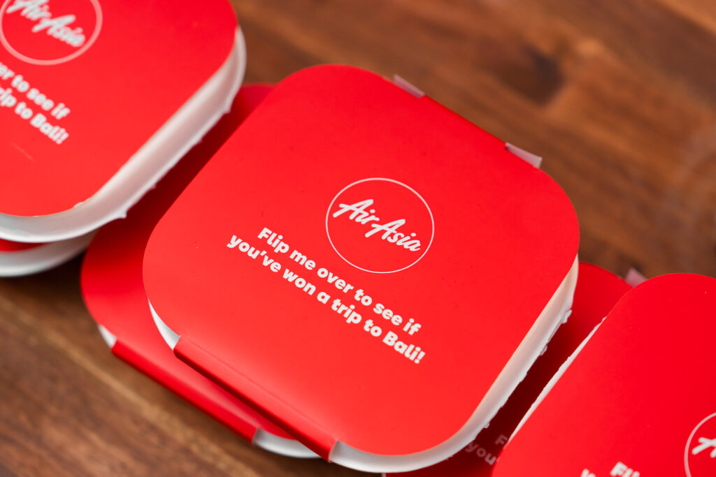
Designed to stop shoppers in their tracks, the experience invited visitors to flip the sleeve on their nasi goreng container for a chance to win a trip to Bali with a friend while taking in the sights, sounds, and flavours of a vibrant Balinese marketplace.
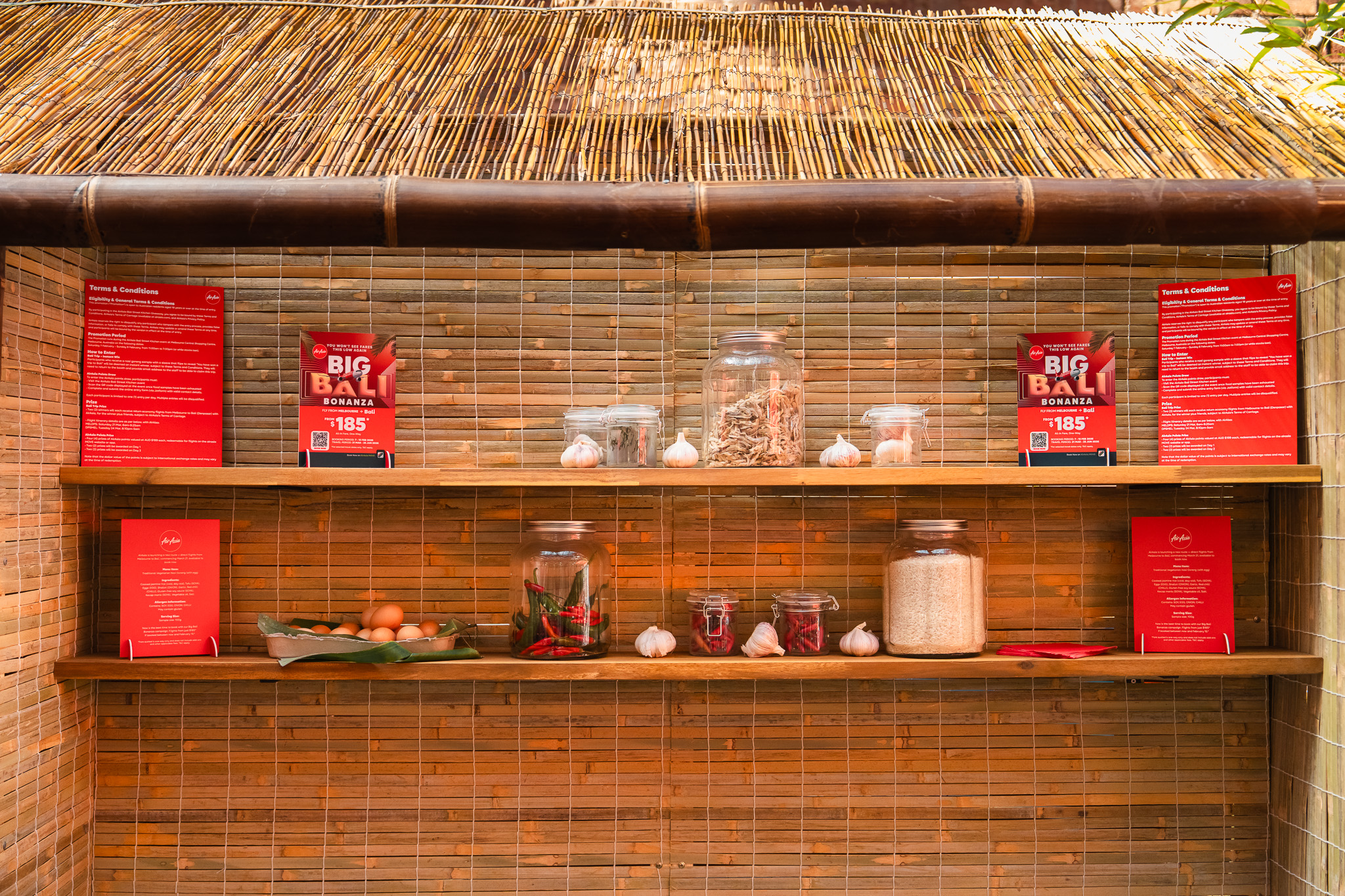
Guests enjoyed freshly prepared nasi goreng served from a hut-style kitchen, surrounded by bamboo textures, market details, and relaxed island seating.
The activation transformed the busy shopping centre into a playful tropical escape, celebrating travel, connection, and discovery for curious visitors.
WHAT THE CLIENT NEEDED
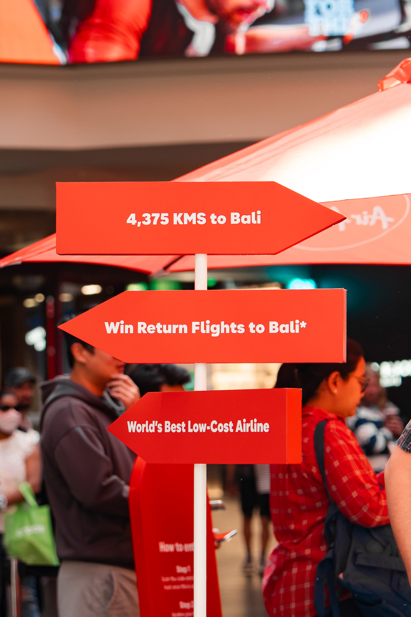
AirAsia wanted an engaging, high-impact activation that would excite shoppers about travel while creating a strong, tangible connection with their brand. The brief called for a fun, interactive experience with a distinctly Balinese feel, encouraging participation through a simple competition mechanic that was easy to understand and inviting for all audiences.
The activation needed to attract attention, hold it, and leave visitors with a memorable moment that captured the excitement and allure of escaping to Bali. It also had to work seamlessly within Melbourne Central’s busy environment, stand out visually from a distance, and provide natural opportunities for social sharing, brand awareness, and meaningful engagement with the AirAsia brand.
Ultimately, the experience had to feel immersive, approachable, and memorable, leaving visitors with a strong and lasting impression of AirAsia’s travel offerings and the excitement of the destination.
Bali Vibes, Melbourne Style
We approached the activation as more than just a stand. Our goal was to create a moment of transport, giving shoppers the feeling that they had stepped into a small corner of Bali right in the heart of Melbourne.
The concept centred around a market-style hut, bamboo structures, and casual seating that created a warm, inviting atmosphere, encouraging people to pause, explore, and interact. Every element was carefully considered to evoke a Balinese market while remaining practical for a busy shopping centre environment.
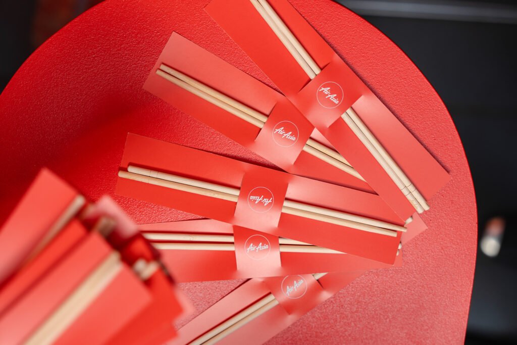
The “Flip Me Over” interaction was built into the nasi goreng containers, adding a playful layer of curiosity and surprise, giving visitors a reason to engage and stay longer. The live serving of freshly cooked nasi goreng strengthened the sensory experience, adding aroma, flavour, and movement to the space.
Ultimately, the activation balanced authenticity with fun and functionality, creating a visually appealing, interactive, and memorable experience that kept the AirAsia brand front and centre.
How We Activated
The activation came to life through a carefully designed Balinese-style setup, featuring a hut-inspired kitchen, bamboo elements, and relaxed seating that evoked a lively market scene. Every detail was considered to create an inviting, immersive environment that drew shoppers in and encouraged them to explore.
Situated within Melbourne Central, the space naturally attracted foot traffic, capturing attention and prompting visitors to step closer. At the heart of the experience was the “Flip Me Over” mechanic, cleverly integrated into the nasi goreng containers where guests could flip the sleeve for a chance to win a trip to Bali with a friend. This playful interaction added excitement, surprise, and a clear call to action, giving people a reason to engage.
The live serving of freshly prepared nasi goreng added energy and aroma, strengthening the sensory connection to Bali. The result was an activation that was immersive, interactive, and left visitors with a memorable, fun, and distinctly AirAsia experience.