Poppin like its hot
Pop It is a vibrant lifestyle brand offering a wide range of fun products from masks and pop its to toys and accessories. To better showcase this diverse assortment, we reimagined their retail display to reflect the brand’s playful spirit while bringing clarity and order to the presentation.
Using display shelving with matching buckets and clear price ticketing, we transformed the chaos into an organised, ‘Marie Kondo’ style setup that felt curated and approachable. The consistent layout guided customers through the range, making it easier to explore and understand the full offering, resulting in a more enjoyable and intuitive shopping experience.
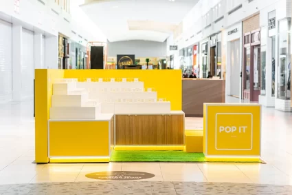
Focusing on bold colour and product consolidation, we created a vibrant, cohesive display that simplified the assortment while dialling up the fun. The result was a well-organised setup that caught attention and invited shoppers to browse effortlessly. This custom-built, semi-permanent fixture was designed for easy roadshow use across multiple centres. Multiple storage openings allowed quick access while maintaining a tidy and functional layout. Bright, open and viewable from all angles, the display attracted foot traffic and provided practicality for both staff and customers alike.
What The client needed
Pop It needed a makeover, something that would appeal not only to Centres but also to customers. The key was colour and consolidating the product range, as Pop It offers everything from masks and pop its to toys and accessories.
We focused on creating a bold, cohesive display that simplified the offering while dialling up the fun. The result was a vibrant, well-organised setup that caught attention and made it easier for shoppers to explore the full range at a glance.

Portable Design with Purpose
This was a custom build designed to be semi-permanent, making it easy to roadshow into other centres while maintaining a consistent and high-quality presence. The structure was developed with flexibility in mind, allowing it to be installed, packed down, and reconfigured efficiently across multiple locations.
We included multiple storage openings for easy access, ensuring staff could quickly retrieve stock and keep the space organised throughout the day. This helped maintain a clean and polished look, even during busy periods.
The layout was designed to remain tidy and functional at all times, supporting smooth operations while enhancing the overall customer experience. Bright, open, and visually engaging from all angles, the setup naturally attracted foot traffic and invited people in.
At the same time, it remained practical for both staff and customers, striking a balance between strong visual appeal and everyday usability across different retail environments.
How We Activated
Using display shelving with matching buckets and clear price ticketing, we transformed what could have felt chaotic into an organised, ‘Marie Kondo’ style display. This approach brought a sense of order and clarity to the space, making it feel curated, approachable, and easy to shop.
Each product category was thoughtfully grouped, allowing customers to quickly identify different options without feeling overwhelmed. The consistent use of materials and layout created a visually cohesive environment that reinforced a sense of structure and simplicity.
The clear pricing and uniform presentation helped remove friction from the shopping experience, giving customers confidence in their choices and encouraging them to browse more freely. The overall layout naturally guided movement through the space, making it easy to explore the full range.
The result was a clean, intuitive retail experience that balanced visual appeal with practicality, helping customers better understand what Pop It had to offer while making the space feel inviting and enjoyable.
