What's on the Menu
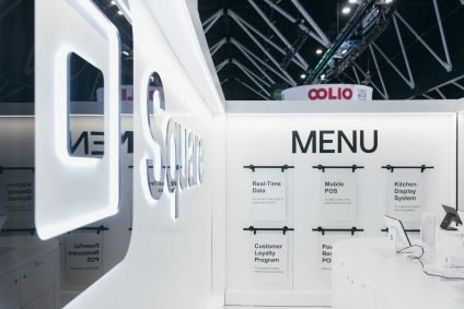
Square’s pop up booth made a striking impact through its thoughtful design and functional layout. A standout feature was the bold “MENU” wall display, styled to resemble a modern restaurant menu while clearly highlighting Square’s hospitality technology solutions. Each hanging card showcased a different offering, from Real Time Data insights and Mobile POS to Online Ordering and Kitchen Display Systems.
High gloss counters, product plinths, and integrated screens allowed attendees to explore and test Square’s payment terminals and software firsthand. The clean black and white palette reflected Square’s brand identity, while the modular design enabled easy updates and adaptability for future events.
The combination of smart signage, hands on interaction, and streamlined layout created an engaging, approachable environment. It not only simplified complex product messaging for visitors but also reinforced Square’s professional and innovative presence, leaving a lasting impression on the hospitality focused audience.
WHAT THE CLIENT NEEDED
The goal was to create an interactive booth that captured the energy of Fine Food Melbourne while reflecting Square’s strong connection to the hospitality, café, and food service industries. It needed to do more than look visually appealing. It had to engage visitors, communicate the brand’s story, and provide hands-on opportunities to explore products.
The space needed to stand out on a busy exhibition floor, draw people in, and encourage conversation, demonstrations, and interaction. The focus was on creating an environment that reflected the brand’s personality, made first impressions memorable, and allowed attendees to experience the products in a way that felt approachable, informative, and engaging.
This approach ensured the booth met the brand’s objectives while standing out among competitors and creating meaningful connections with visitors throughout the event.

Big branding for a big brand!
We wanted the booth to capture both the essence of Melbourne’s vibrant coffee culture and the sleek, modern aesthetic of Square’s branding. Our thinking was that the best way to achieve this was to bring the café experience directly to the show floor, creating an environment that felt immersive, authentic, and inviting.
Every detail was considered to make visitors feel at home while clearly understanding the brand’s offerings. We used playful café-style lettering and signage to communicate Square’s key benefits in a familiar and approachable way. The layout, interactive areas, and product zones were all designed to encourage engagement, spark conversation, and guide attendees naturally through the space.
Our goal was to turn a standard exhibition stand into a memorable experience that felt like stepping into a local café. By combining everyday charm with practical information, we created a space that reflected the brand and delighted visitors.
HOW WE ACTIVATED
The activation centred around a striking LED Halo structure that provided height, visibility, and a strong architectural presence within the exhibition hall. Positioned beneath the Halo, a Myriad counter created a practical engagement point for staff and visitors, while a custom café-style signage wall reinforced the hospitality-inspired theme.
An illuminated LED Square logo served as a key focal point, helping visitors easily identify the brand from a distance. Plinths were strategically positioned throughout the space to showcase Square’s hardware and technology solutions, allowing attendees to view products up close and engage with demonstrations.
The combination of clean branding, strong sightlines, and thoughtfully curated display areas transformed the compact footprint into an inviting and memorable brand experience. The result was a stand that encouraged interaction, supported product education, and delivered a strong presence throughout the event.
