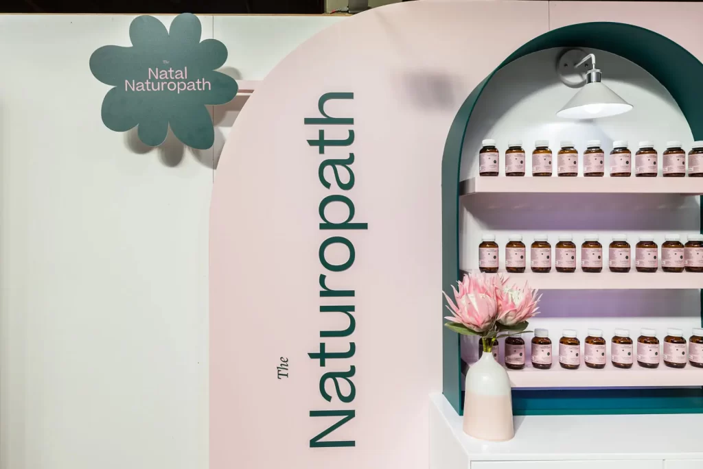
HANDS DOWN THE BEST LOOKING STAND!
The Natal Naturopath creates innovative, science-backed vitamins designed to support health and wellbeing. Their approach combines expertise with a modern, approachable identity, making wellness accessible and engaging for everyone.
For their activation, the counter shapes were highlighted with custom decals and Archie walls were coloured to match the brand’s Pantone palette. A subtle curved floor design added detail and visual interest, creating movement and depth throughout the space. Layered textures and materials enhanced the overall aesthetic while keeping the environment clean and approachable.
Every element was carefully positioned to showcase products effectively and make the space inviting. By combining brand-specific colours, bold shapes, and subtle details, the activation brought The Natal Naturopath brand to life in a playful yet refined way. Visitors were encouraged to explore, interact, and connect with the brand in a memorable, immersive experience.
WHAT THE CLIENT NEEDED
As a first-time exhibitor, The Natal Naturopath needed to make a strong and memorable impact. The goal was to create a pop-up that would capture attention in a busy environment while clearly communicating the brand’s identity and values. Every aspect, from bold visuals and colour schemes to layout and product placement, had to work together to make the space instantly recognisable and inviting. Interactive elements were essential to encourage visitor engagement, allowing people to connect with the brand in a hands-on way. The overall objective was to leave a lasting impression, spark curiosity, and ensure The Natal Naturopath stood out from the competition.

A Cohesive Touch
The Natal Naturopath had beautiful branding and icons, and our approach focused on highlighting these in a way that felt cohesive and impactful. We carefully integrated the branding across all key touchpoints, from custom decals and signage to subtle details on plinths and shelving, ensuring that every element reinforced the visual identity and made it instantly recognisable.
At the same time, we wanted to maintain a clean, uncluttered environment that encouraged visitors to explore without feeling overwhelmed. Each design decision was made to balance aesthetics with functionality, creating a space that was both visually engaging and easy to navigate. By thoughtfully placing branding elements and paying attention to scale, colour, and positioning, the activation was able to showcase The Natal Naturopath’s identity while supporting interaction with products and displays. The goal was to create an immersive, inviting space that felt true to the brand and left a lasting impression.
HOW WE ACTIVATED
We incorporated the brand’s identity into every element of the space to create an activation that was visually cohesive and engaging. Different shapes on the counter were highlighted through custom decals, while the Archie walls were coloured to perfectly match the brand’s Pantone palette. These touches ensured the brand was instantly recognisable and consistent across all display areas.
The floor featured a subtle curved design that added movement and visual interest, complementing the shapes used throughout the space. Layering textures and materials further enhanced the overall aesthetic, creating depth and dimension without overwhelming the environment.
By carefully balancing playful elements with refined design choices, we created a space that felt approachable yet polished. Each detail, from colour and shape to layout and texture, worked together to bring The Natal Naturopath brand to life. The result was a memorable, immersive experience that encouraged engagement and left a lasting impression on visitors.

