What the client needed
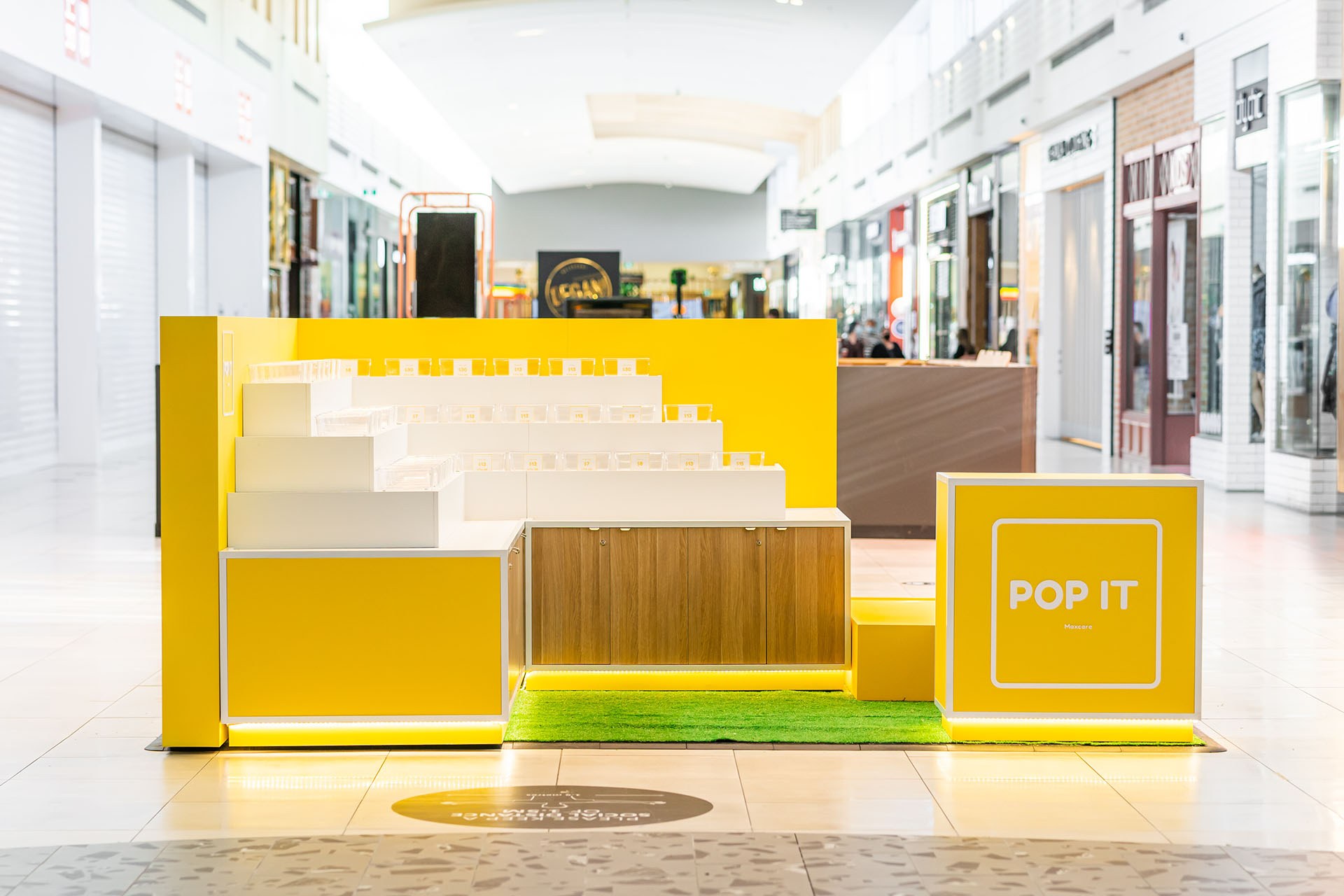
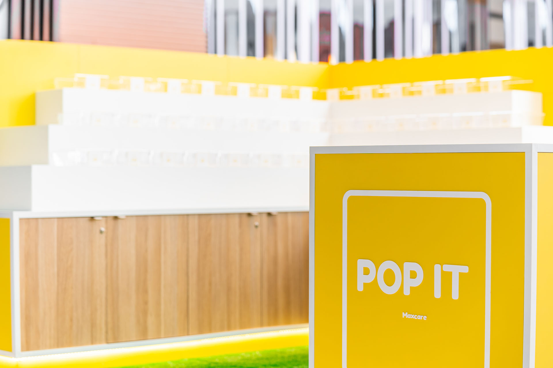
Pop It needed a makeover, something that was appealing to the Centres but also to the customer. They key was colour and consolidating product as Pop It has a full range of products from masks, pop it’s, toys and accessories.

How we activated
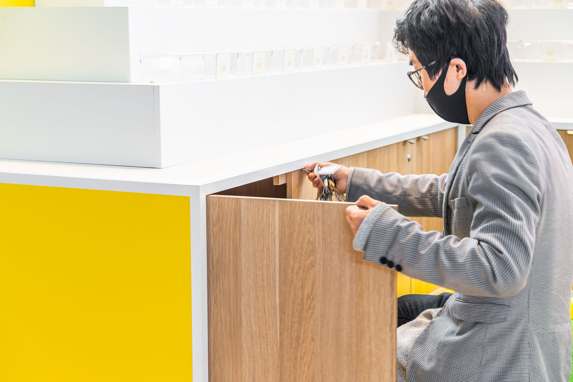
This was a custom build so we ensured that the build would not only be semi-permanent so that it could easily roadshow into other centres. We also designed this to accommodate multitude openings of storage, be presentable bright and open spaced from all angles.
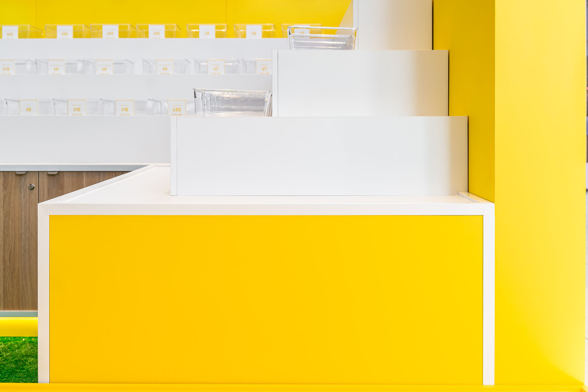
Using display shelving with the same display buckets and price branding ticketing, we were able to consolidate the chaos into an organised ‘Marie Kondo’ kind of display. This would assist in educating the customer on what Pop it had to offer.


